
Some of the nuts-and-bolts of teaching interactive and motion design, as learned in my Interactive and Motion Graphics I through IV courses at Eastern Illinois University:
1) Fundamentals are key • Foundational courses are critical. 2D design, drawing, image creation in various forms and mediums, color theory, art and graphic design history courses, and constant exposure to and critical analysis of the best contemporary graphic design and art—these form the bedrock on which upper-level courses are built. Add in a desire to work hard, too.
2) Get comfortable “breaking code” • I begin Interactive and Motion Graphics I by teaching code the first day, by “getting our hands dirty with code.” I demonstrate how to read and write HTML5; we style typography, create layout structures, add images, and upload. Most students are nervous, having had little or no coding experience. We write and “break code” intentionally, to get comfortable with making “mistakes.” Then we are off and running with weeks of demos and exercises.
3) Code is a language to be read, understood and mastered • HTML, CSS, Javascript, etc., are languages to be read, understood, and modified for your own design purposes. Students are taught to thoroughly understand the basics of HTML5, how the “design engine” of CSS controls the look and function of a site, and how to organize files/folders effectively. A thorough understanding of the basics of code goes a very, very long way. With a firm understanding of the basics, more advanced coding becomes less intimidating, and often exciting.
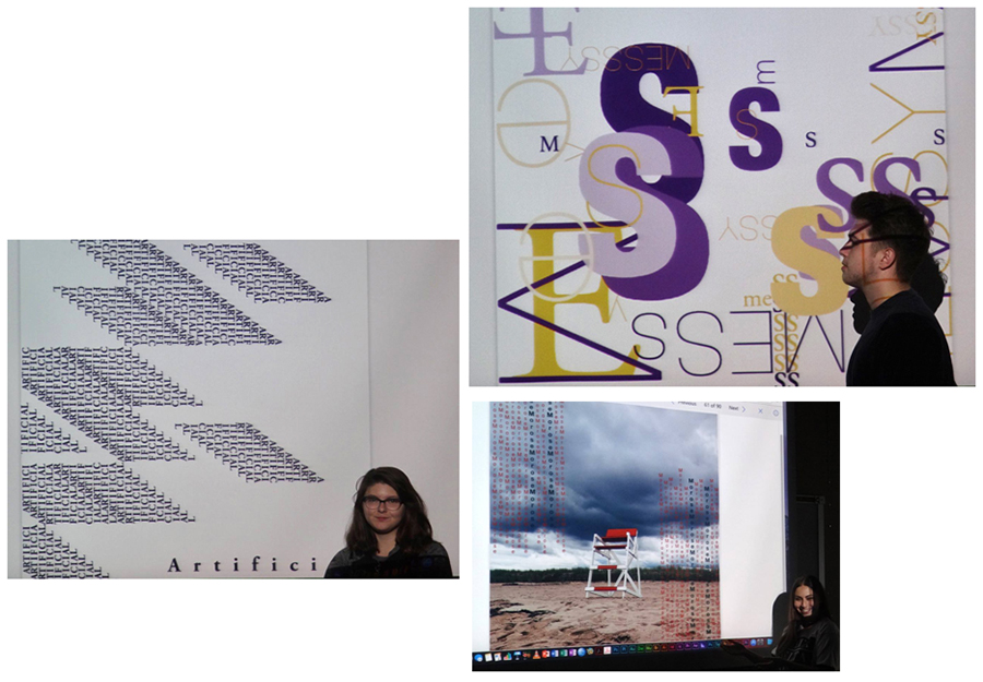
4) Make meaningful visual connections between form and content • The essence of graphic design is to create meaningful and visually compelling communication and experiences, and interactive and motion design can too easily become filled with “bells and whistles.” Students must be able to articulate why an interface structure (or technique in motion design) works for the intended audience and how it faciltates or enhances user experience and understanding.
5) Responsive design is standard practice, but can be tricky for students to code • Responsive design (a site’s form and content changing according to the device viewport, from desktop to mobile) is standard practice. By Interactive II, students understand how to implement media queries, but it isn’t until Interactive III and IV that most students can successfully design and code a responsive site with any degree of visual complexity. It’s just that the code gets deep, quickly. Therefore, students have the option of designing non-coded reponsive layouts (static visuals only), in addition to desktop- or tablet-ready coded sites, to demonstrate their design strategies. For students interested in interactive media as a career, I strongly encourage them to have several fully responsive sites in their portfolio by graduation.
In all of my courses, students are steeped in the process of research, ideation, refinement, and final production. Research-based exploration and invention are essential. “It’s in the very process of looking at something that makes it beautiful,” David Hockney has said. I try to inspire students to take this approach in all that they do—by deeply looking at and thinking about code, or the nuances of fine typography, or the research they have gathered, or graphics in subtle motion over time. It’s all quite beautiful, and all a lot of fun.